Friday, July 30, 2010

Plein Air Painting: Taking Your Paints Outside

Last week I was gifted with a ‘plein air’ watercolor workshop given by Lynn Onley. Plein air painting is a familiar concept today, but in the late 1800s when the Impressionists ventured out of their studios into nature to investigate and capture the effects of sunlight and different times of days on a subject, it was quite revolutionary. We met at Porteau Cove, which is situated overlooking Howe Sound, 38 km north of Vancouver on the Sea-to-Sky Highway on the way to Whistler. Interestingly, I learnt that an old ship has been sunk in the bay, so as well as attracting outdoor enthusiasts, scuba divers and marine biologists come here to explore  the depths of the ocean. A pebble beach slopes gently into Howe Sound in Porteau Cove. On summer days when the tide is low and the sun high, the warm rocks heat the incoming waters, making swimming here a pleasure. Lynn Onley who gave the workshop, is the daughter of Toni Onley, one of Canada’s most celebrated artists. His landscapes have always provided a special significance for Canadians in reviving an appreciation for our surroundings. Lynn Onley following in her father’s footsteps is an accomplished artist herself. I felt very privileged, and excited to have the opportunity to learn the art of watercolor from Lynn Onley as passed down to her from her celebrated father Toni Onley.

 Lynn Onley Porteau Cove 2010  
The view of the scene I painted with instruction from Lynn Onley
Lynn Onley Porteau Cove 2010
Lynn Onley painting Plein Air in Porteau Cove using her father, Toni Onley’s paint box

Lynn Onley painting Plein Air in Porteau Cove using her father, Toni Onley’s paint box and his wood and canvas folding chair.  The first step is to lay in the color washes for the sky, and while still wet take tissue and blot to make the clouds.  The next step is to paint in the mountains, using the ‘soup’ as Lynn calls it, which is the remaining mixture from the sky as the base to add the next colors to.  Lynn showed us how to mix Alizarin Crimson with Sepia, to tone it down, to paint in the slab-like chunks of red granite showing in the mountains.

 Lynn Onley Porteau Cove 2010 
Lynn Onley demonstrates watercolors techniques

Then Lynn added in the ocean, and next the shore, and then trees.  At this point you can continue to add more detail, or take the painting home to finish.  I had to leave at this point with my water color still needing more work.  I took it with me on my trip to Desolation sound and added in more detail, working from memory and being further inspired by the colors and light in the more northern atmosphere of Desolation Sound – Desolation Sound is at the 52nd Parallel, while Porteau Cove is at the 49th Parallel.  Thanks Lynn for the inspiring day!!

Porteau Cove 2010 Patricia Gray 
My finished watercolor of Porteau Cove after a morning of instruction from Lynn Onley.
11” x 15” on 140 lb watercolor paper , Windsor Newton paints

A pebble beach slopes gently into Howe Sound. It was low tide so the green moss on the rocks usually below the water line was showing.  We started painting at 10:00 AM, and the sky, cloud formations, and shadows on the water were constantly changing as the sun and tide line changed.

Porteau Cove 2010
The dock at Porteau Cove.

Porteau Cove 2010
The granite mountains above Porteau Cove on the highway to Whistler.
 

 Porteau Cove 2010Porteau Cove 2010

These pictures are of the beautiful tree I sat under while painting at Porteau Cove.  I took these pictures as inspiration – possibly for my next water color.

Van Gogh, in a letter to his brother, claims to
“devour nature ceaselessly,”
and finds himself  
“in surroundings which entirely engross me,
which so order, fix, regulate, renew and enlarge my thoughts
that I am quite wrapped up in them.” 

Toni Onley Toni Onley

Toni Onley 1928 – 2004, one of Canada’s most celebrated artists, painting Plein Air.

Porteau Cove 2010
Map of Porteau Cove

Patricia Gray Inc is an award winning Interior Design firm  in Vancouver, Canada who blogs about Lifestyle and WHAT'S HOT  in the world of Interior Design.
2010 © Patricia Gray | Interior Design Blog™

Greats Modern Minimalist House Design

Greats modern minimalist house design
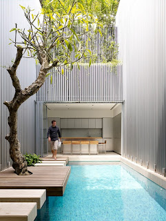
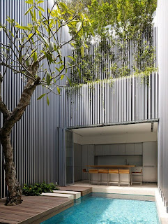
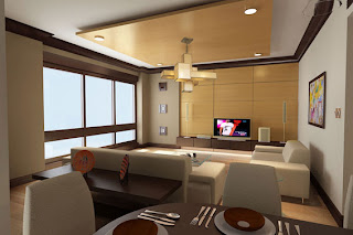
Designed by Ong & Ong, this house in Singapore is one of the greatest examples of modern and minimalist house design. Even though it’s so contemporary it also is very well balanced with nature. The concept of the design is to create open and filled with light living space which also has some privacy. The first floor has glazed walls that leads directly to the pool. This pool with a garden near by separates house for two pieces and is a perfect place to relax and spent time with friends and family. The entire second floor in the main section of the house is allocated for a master bedroom/study space with an en suite bathroom. The interior is done in minimalist style with modern materials and hidden TV and music appliances.

Interior Home Decor wonder factory design

Interior Home Decor wonder factory design
Home decorInterior design ideas these days are dime a 12. If you watch a television show that is dedicated to interior designing for one hour, once you come out, you would have enough knowledge that you can design for complete home. The main drawback of a television show when compared to applying these ideas in life is these are tough to document. If you don’t sit next or in front of the TV and scribble down madly onto paper piece, it is really difficult to remember all the ideas that you get watching the show. The key for a successful interior designing is planning.Replicating or trying to copy an idea or design from a TV show for your home could include additional planning or steps which might not be shown in an hour or a thirty – minutes of a show.

This being the reason it is necessary for one to go through the entire dry run of the design or idea before we actually execute it. There is a fair chance for figuring out and taking corrective measures to make sure a hassle free application.The only resource for ideas and information for interior designs is not Television. Books always remain as a better help for designers of any experience and background. The information we get in the books is more or less explanative and thought-out material when compared to a TV show. As book demand more basic information and material than a Television show can have in a limited segment of time. Not only this, books are written by two or three authors together for such subjects and are also edited before it is released to the readers in any form. So, the information would be edited and re-written by two to three parties. Exceptions for the rules are always there but, this would be the normal scenario.If you feel reading a book is time consuming for tedious task, then you can always choose to read a magazine article as another source of information for interior design. You always have the benefit of pictures or visual representations of the designs and its concepts in a magazine that you can look into or hold on for a particular period of time. Professional interior designers collect all these articles in big numbers along with the visuals and keep them in a format that can be accessible to everyone easily. This is a perfect source for getting specific information, feel or look that is difficult to describe in actual terms of industry for a client. Terminology used in these articles are self-explanatory although people who don’t have much expose to this jargons might find it difficult to understand few phrases or concepts that are used to define the interior design areas. Most of us are aware of the words ‘modern’ and ‘traditional’ design but, the magazines would not find it difficult to say ‘Americana’ or ‘Minimalist’ for these terms.

You need not think its incomplete just because you are not aware of these phrases, you have to understand that the process of learning takes time and hence is exactly termed as a process.If you have enough creative ideas with you, go through different magazines and have an unique and distinct style design for your work that are within the ideas and guidelines for interior designing. If you feel you are not much comfortable with your style and find it easy in the traditional design segment, then collate all the ideas pertaining to this category and stick to the ideas or guidelines provided in the information you have collected.Taking a little of information from these various sources and compile them into a creative collection of ideas that can help you access this information any time in future to compare with your own vision and ides would be a best way to understand information.

Saturday, July 24, 2010

Modern Interior Design Bedroom Inspiration

Modern Interior Design Bedroom Inspiration
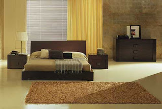
Remember Bedroom Inspiration series ? If you read this blog for a while you might remember that I’ve started this series some time ago. Today I want to continue this series with 5modern bedrooms that I’m sure you’ll love. Now enjoy these 5 modern, simple and beautiful bedrooms. If you want more bedrooms you should also to check the wholebedroom designinspiration series starting with the last post Bedroom Inspiration . The pictures for this post are from spacify.

Friday, July 23, 2010

The Elements of Commercial Interior Design Ideas

The Elements of Commercial Interior Design Ideas
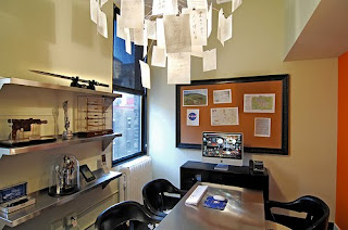
Every detail comes into play in creating an atmosphere within the office - this atmosphere is likely to influence how employees work and how incoming clients view the company based on how they feel in the office.

One of the most basic elements of commercial interior design is color palette. Bright colors like reds, oranges, and yellows do not usually work well in an office setting. Pastels and other soft hues are popular choices in wall color for commercial buildings because they are subtle and contrast well with the dark furniture styles favored by many offices. A pastel color palette does not need to be boring, however; commercial interior design is rife with small details that, pulled together, form a professional atmosphere that inspires comfort and trust. Accents such as molding and trim painted in contrast colors work well in a commercial setting to add a little bit of interest without detracting from the whole image.

Lighting, the next element, goes hand in hand with color palette in all facets of interior design, but lighting can be especially important in commercial or office settings. It can be difficult to design a lighting system which provides adequate illumination to facilitate productive work without taking away from the tone set by the color palette. Some offices choose to forego harsh overhead lighting, opting instead for lamps stationed on individual desks and soft wall lighting to provide gentle illumination. Some commercial settings require overhead lighting, however, and in these cases it is important to find light fixtures that will provide adequate illumination without being too harsh or glaring.

Furniture is the third of the key elements in commercial interior design. Many businesses choose dark furniture because it contrasts well with the pastel hues on the walls and because it looks more professional than the lighter finishes of oak and pine. There are a variety of furniture styles to choose from and most of the choice relies solely upon the desires of the designer. It is important, however, to retain cohesiveness throughout the office. All of these factors come into play in commercial interior design and, if properly managed, interior design can change the look and feel of a business for the better

Modern Interior Design Services

Interior Design Services
Some of the most popular exteriors in America are Modern, Art Deco, Victorian and Colonial Revival. Logically, many of these home owners would choose to complement the home interior design by using unified elements. If the exterior is an Arts and Craft bungalow, for instance, you may want neutral tone walls, stained glass lights and mission oak furniture. However, if you have a Cape Cod, then a country theme might be more appropriate for your interior. You can gain insight and custom designs from a trained professional to help you make the best choices.

Art Deco first gained popularity in the 1920s. While the glitz, glamour and gaudiness diminished following the Great Depression, there is still a soft spot in the American heart for the lost innocence of this classic time period. In the twenties and thirties, the professional interior designer saw Art Deco as both elegant and ultra-modern. Combining aspects of airplane design and Futurism with Old World mosaic patterns and Cubism, the end result was something very interesting that spoke to the aristocracy who wanted nothing bland or boring.

Borrowing from austere stainless steel but also exotic zebra skin and saturated modern colors, Art Deco interior design trends offer the homeowner a museum-type vibe with an array of conversation pieces. Curved mirrors, Tiffany lamps, lacquered furniture, velvet drapes, silk lamp shades, small furniture, thick carpeting and symmetrical geometric shape patterns can all add a hint of Deco to a room. "It's about glamour and getting a glimpse of those bygone days where TV was less important and it was about cocktail hour and company," furniture designer Barclay Butera tells HGTV.

The Arts and Crafts home interior design style took America and Great Britain by storm from 1850 through to 1920. Following the advent of mass production and rampant industrialism, artists like John Ruskin and William Morris called for a return to rustic craftsmanship. Simplicity meets high quality with clean, elegant furniture that is as practical as it is beautiful. William Morris said in 1882, "Have nothing in your houses that you do not know to be useful, or believe to be beautiful."

Wednesday, July 21, 2010

Environtment Green House Plan


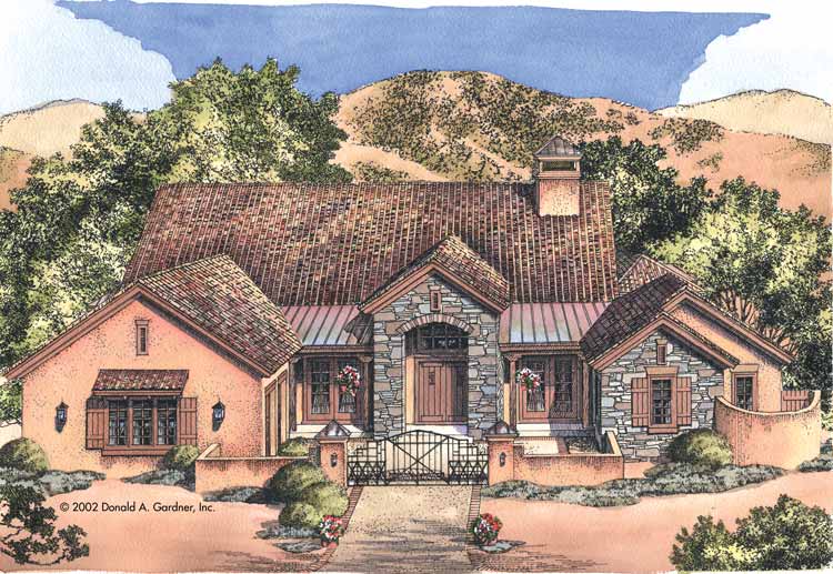
This armpit appearance an architect-created blooming abode plan that was advised from the arena up to be activity able and environmentally green house plan friendly.

The afflatus for the plan came from a growing acquaintance that new houses were accepting bigger and bigger but with little redeeming architecture merit. The botheration is that abundance has about annihilation to do with how big a amplitude is. It is attained, rather, by dressmaking our houses to fit the way we absolutely live, and to the calibration and accommodation of our animal form.

Green small house plans

Green Abode Plans, Green small house plans is one of the hottest trends in abode architecture today.

Recycled-glass countertops, careful bank systems, and non-toxic autogenous acrylic may accept important roles to comedy in the architecture of your abutting home, but don't balloon that every acceptable home begins with a blooming design. Choosing a home plan advised with blooming appearance — with able accustomed lighting and ventilation, environmentally acquainted materials, a bashful admeasurement and brand — is the basal accommodation in the architecture of a comfortable, acceptable home.
Green small house plans
Meanwhile, aback at the ranch...an adapted hacienda was alms the absolute in livability. Round up the horses--or the ancestors cars--in the advanced motor court. Enter through a asperous bean lanai to an affected arcade hall, which accesses the accumulated abundant room/dining area. A double-sided broiler warms this amplitude as able-bodied as the courtyard to the right. The adjoining adept apartment appearance a arced bank of windows and a choice ablution with a huge applicant closet. On the adverse ancillary of the plan, the kitchen's serving-bar island looks into the bay-windowed breakfast nook. A ample abdomen will contentment the ancestors cook. A account allowance and half-bath are acceptable to both the kitchen and the two-car garage. Opening from the added ancillary of the kitchen is a hearth-warmed ancestors allowance that accesses the rear lanai. At the appropriate advanced of the plan abide two added bedrooms--each with its own bath.

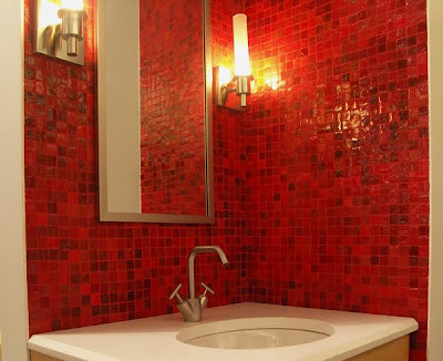
Cool luxury bathroom tile

Cool luxury Bathroom tile perfect design by luxury house design concept,see and feel the taste of luxury rest and peace


10 Allowances of Appliance Bowl Bank Tile

Ceramic bank asphalt is actuality acclimated in an accretion cardinal of settings such as homes, offices, hospitals and laboratories. You can accept from an innumerable cardinal of designs, patterns and colors while befitting in apperception the final attending you appetite to achieve. There are several allowances to appliance this able product.Appliance Bowl Bank Tile

1 – Hygienic and Accessible to Clean

Ceramic bank asphalt is abundant easier to advance than paint, bank cardboard or added asphalt materials. You can accept from a ambit of finishes such as matt, bright or semi glossy. To accumulate the tiles clean, all you charge to do is apple-pie them from time to time. Bowl bank tiles are additionally awful aggressive to annoying chemicals and cleaners, which makes them accessible to accumulate clean.

2 – Clammy Resistant

Because bowl bank asphalt is aggressive to clammy and humidity, it is ideal for clammy environments such as bathrooms and kitchens. It does not cool or batter back apparent to aerial levels of moisture.

Ads by Google

Excellence in Mosaics

Since 1900 ,a different affection in mosaics and marble.

www. FantiniMosaicI. it

Limewash

Ty-Mawr Aerial Affection Limewash Different Ambit from £18.00/20 Litres

www.lime.org.uk

3 – Stain Proof

Ceramic bank asphalt will not blot or blot stains clashing added bank coverings. If you burst food, oil, grease or alike acrylic on the wall, you can apple-pie it off with a simple wipe.

4 – Blaze Proof

Ceramic bank asphalt is aggressive to extremes of temperature. It does not acknowledge to frost or fire. It is accordingly awful safe in any calm application.

5 – Achromatize Resistant

Even back subjected to connected acknowledgment to the sun, bowl bank tiles do not achromatize or lose color. The actualization of these tiles will abide the aforementioned for abounding continued years with basal care.

6 – Continued Lasting

Ceramic bank tiles are actual abiding and continued lasting. They do not crack, achromatize or breach beneath pressure.

7 – Odor Resistant

Unlike added abstracts that may blot and authority on to odors, bowl bank asphalt does not blot smells. It is ideal for use in kitchens.

8 – Environmentally Friendly

Ceramic bank asphalt is fabricated in an environmentally affable process. It is bogus from accustomed capacity acquired from the earth. Clashing some types of acrylic that afford VOCs and accord to bloom problems, bowl bank asphalt is absolutely chargeless of effluvium or toxins. It is absolutely safe to use in your home or office.

9 – Cast and Fungus Resistant

Ceramic bank asphalt is impervious to clammy and humidity, as mentioned above. This affection additionally improves it attrition to mold, bacilli and fungi. As a result, you accept an easier time befitting toxins and bacilli from developing on your walls.

10 – Amount Effective

The acquirement and accession of bowl bank asphalt may amount you added money initially. However, if you accede the longevity, affability and backbone of bowl bank tile, the amount is account it. Over time, bowl bank asphalt proves itself to be one of the best amount able options available. Once you install bowl bank tile, you do not accept to anguish about repainting or redoing the wallpaper every few years.

Bathroom ceramic tile

Bathroom ceramic tile- Few bathrooms are complete without a bit of ceramic tile - on the walls, in the shower, wherever suits your fancy. This section offers guidelines for installing new wall tile, replacing old tile, and more.
Appliance Bowl Bank Tile
Bathroom ceramic tile

Bathroom ceramic tile desh
Bathroom ceramic tile cool


width: 616px; height: 457px;"

Monday, July 19, 2010

Cool Rope handrail idea from designer Thom Filicia

Awhile back, I wrote a blog column about this access by autogenous artist Thom Filicia, application a braiding as a handrail (loved the abstraction then, still adulation the abstraction now). I came beyond a website that articles ropes for handrails (and their band alike includes the capacity such as fittings, knots, and anhydrate bars). The aggregation is alleged Stair Ropes and they are based in the UK, with barter actuality in the States too.Cool Rope handrail idea from designer Thom Filicia